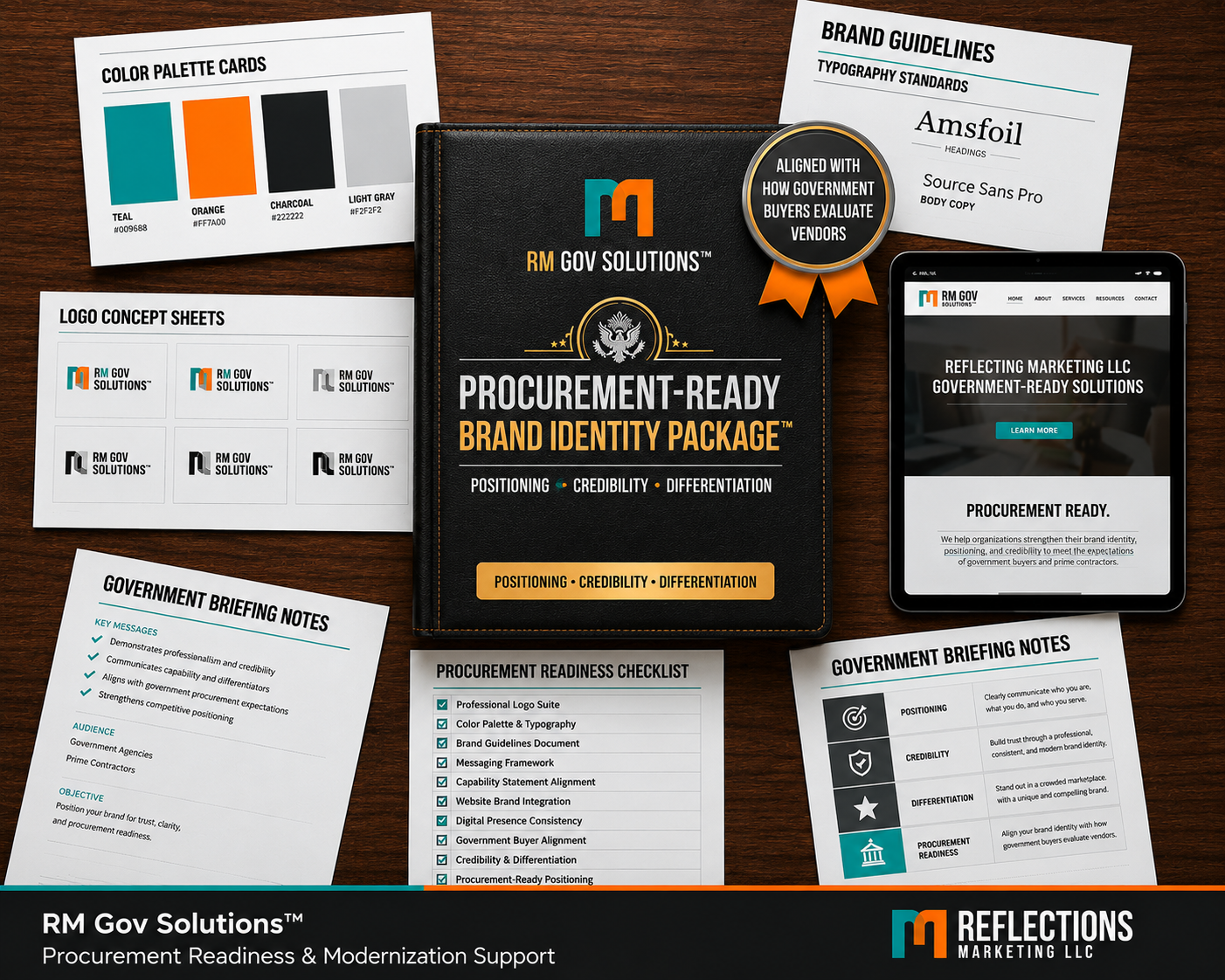
Designed to align your brand identity with how government buyers evaluate vendors, ensuring clarity, credibility, and procurement readiness.
This package develops a brand identity that supports positioning, differentiation, and alignment with procurement expectations.
Rather than generic design, this approach ensures your visual identity strengthens how your business is perceived before engagement with agencies and primes.
We start with the clents vision. A thourough interview helps give our designers a complete feel for your "brand"
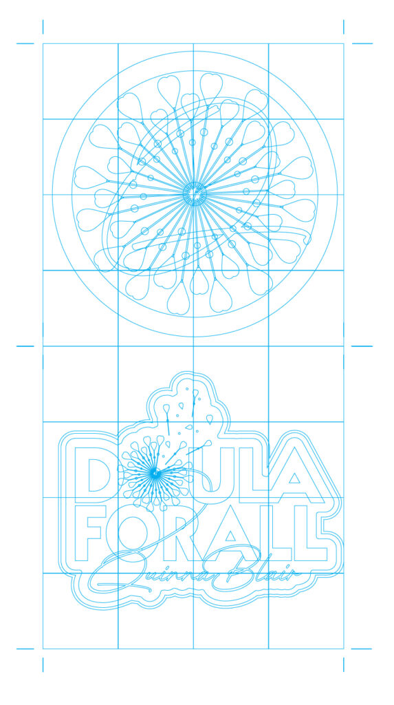
Concept sketches gives us a chance to nail down the right feel, prior to taking your logo to production.
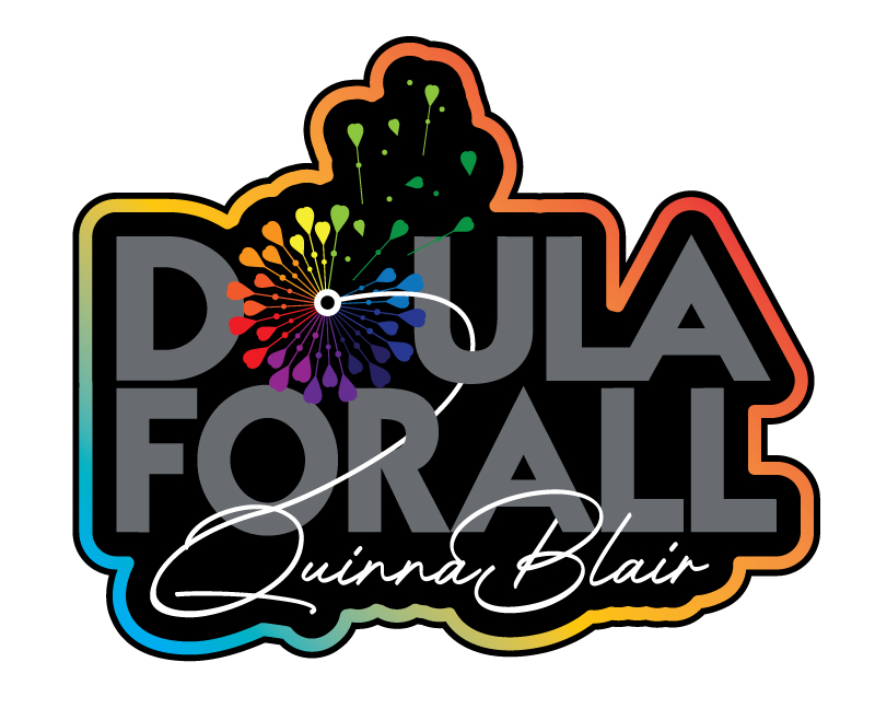
Your final logos are then brought to life in several production ready verions and file formats.
Stages of development: Case Study
1. Synopsis of the Logo Design Process for Quinna
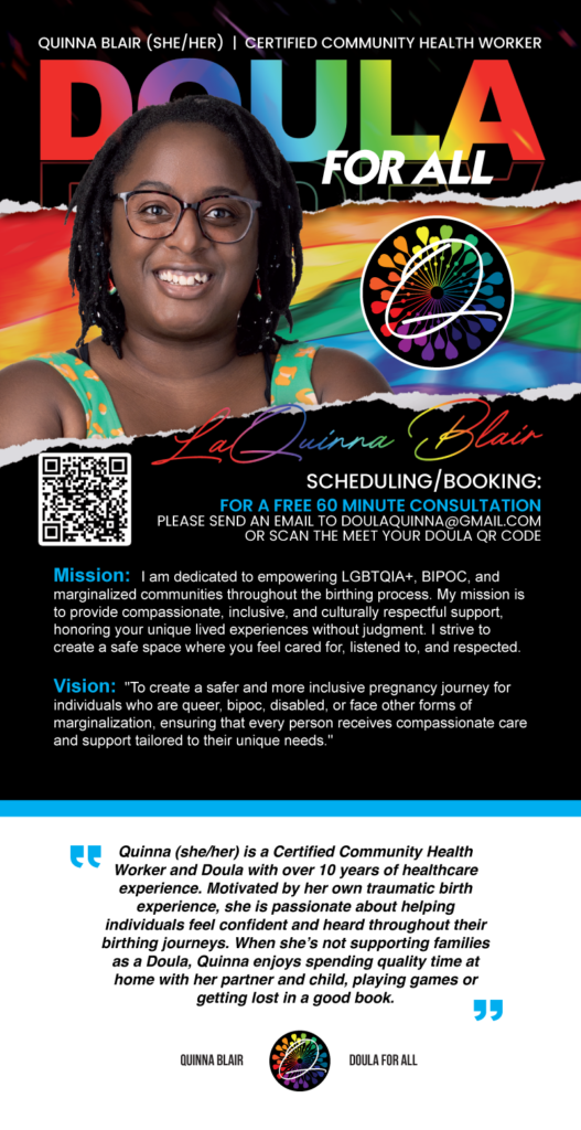
Introduction to Quinna and Her Mission: Quinna, a certified Community Health Worker and Doula, brings over a decade of healthcare experience to her work, fueled by a personal mission to empower marginalized communities throughout the birthing process. Her dedication to providing compassionate, inclusive, and culturally respectful support shapes the essence of her practice. Quinna’s approach is deeply personal, born from her own challenging birth experience, driving her commitment to ensure that every client feels confident, heard, and valued.
Client Interview Insights: During our initial consultation, Quinna expressed the need for a logo that encapsulates the spirit of inclusivity and resilience intrinsic to her brand. She envisioned a symbol that speaks directly to the LGBTQIA+, BIPOC, and disabled communities she proudly serves. The logo needed to convey safety, acceptance, and the transformative journey of birth, reflecting her vision of a more inclusive and supportive birthing experience for all.
Design Concept and Development: Inspired by Quinna’s passionate storytelling and the symbolic nature of her work, we chose the dandelion as the central motif for the logo. The dandelion, a resilient and ubiquitous flower, represents the ability to thrive under challenging conditions, echoing the strength and perseverance of the communities Quinna supports. Its seeds, carried far and wide by the wind, symbolize hope and the spread of new beginnings.
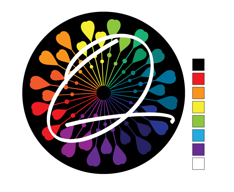
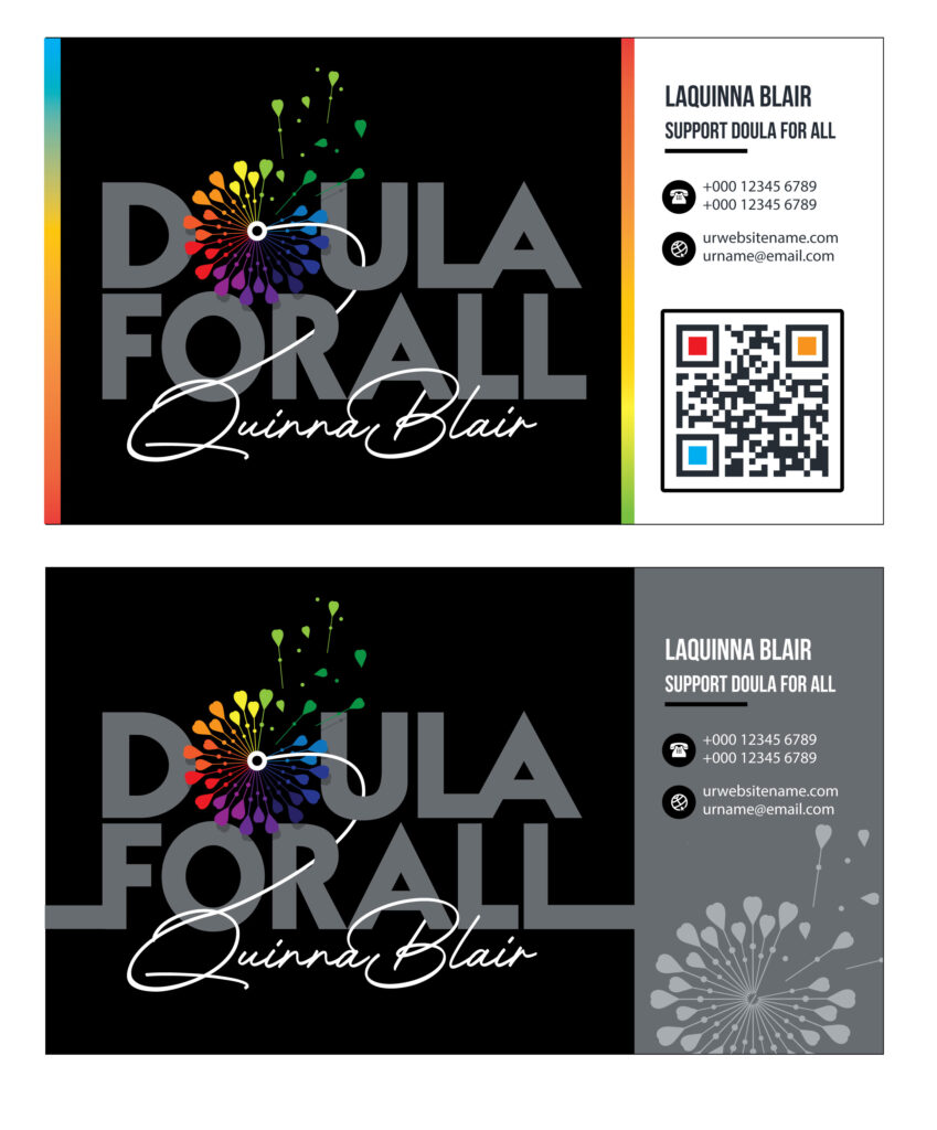
Final Logo Design: The final logo design features a stylized, multicolored dandelion, embodying the diversity of the individuals Quinna serves. Each color reflects a strand of the rainbow flag, a nod to the LGBTQIA+ community’s vibrant spectrum. At the heart of the dandelion, we incorporated a script ‘Q’—a personal touch that represents Quinna herself, central and integral to the birthing journeys she facilitates. This design element ensures that her identity is interwoven with the community-centric values she upholds.
Marketing Utilization: The dandelion logo is not merely a brand identifier but a powerful marketing tool that communicates Quinna’s core values and mission at a glance. It is used across various platforms, from business cards to promotional materials, and is prominently featured in her digital content to consistently remind clients of the safe, supportive space she offers. This logo reassures potential clients of Quinna’s dedication to tailored, respectful care, encouraging them to embrace their unique paths with confidence.
Conclusion: Quinna’s logo is a testament to her life’s work and an emblem of hope and support. It reassures her clients that they are entering a space where their unique needs and identities are not only recognized but celebrated. As Quinna continues to support families in their birthing journeys, her logo stands as a beacon of inclusivity and empowerment.
2. Logo/Identity Creation
Concept sketches give us a feel for weight and spacing.
Defining the color space within the final logo determines the appropriate "vibe" that our clients are looking for.
Alternate arrangements of the logo allow for stylized variations.
3. Additional Assets Developed as Needed
Procurement-Ready Brand Identity Package
Strategic Identity for Procurement Readiness
1. Procurement Positioning & Brand Strategy: Clarify your organization’s capabilities, differentiators, target agencies and prime contractors, procurement objectives, and desired buyer perception to establish the strategic foundation for the brand identity.
2. Identity Concept Development: Develop and refine visual identity concepts that communicate credibility, professionalism, and relevance within government and prime-contractor environments.
3. Color, Typography & Accessibility Alignment: Establish a coordinated color palette and typography system designed for clarity, readability, accessibility, and consistent use across digital and print materials.
4. Procurement-Ready Brand Standards: Create practical guidance for logo use, colors, typography, visual consistency, and appropriate application across capability statements, proposals, presentations, websites, and other buyer-facing materials.
5. Buyer-Facing Application Planning: Identify how the approved identity should be applied across priority procurement communications and engagement materials to strengthen recognition, consistency, and buyer understanding.
6. Review, Refinement & Delivery Coordination: Support structured review, stakeholder feedback, refinement, final file preparation, and implementation guidance based on the approved scope and intended applications.